

Louis Poulsen PH Artichoke Ø 720: Poul Henningsen’s glare-free classic, scaled for rooms
A pendant that reads as architecture
Even in a room full of objects, the PH Artichoke holds attention because its geometry is legible from every angle. The Ø 720 version keeps that presence but lands in a more domestic scale than the oversized lobby classics. It’s a lamp you notice when it’s on—and when it’s off.

Louis Poulsen’s long view on “shaping light”
Louis Poulsen’s identity is tied to modern Danish lighting culture: form is expected to serve the way light behaves. That philosophy—often summarized as designing to shape light—sits behind much of the brand’s catalogue and its ongoing collaborations with architects and designers. See background at Stylepark.
Why the Artichoke exists
Poul Henningsen designed the PH Artichoke in 1958 for Copenhagen’s Langelinie Pavilion, aiming for a pendant that hid the light source while staying visually composed from all viewpoints. Louis Poulsen’s product archive notes the hand-mounted “leaf” structure and the glare-free intent (Louis Poulsen; Louis Poulsen). For an accessible account of the original commission and early copper finish, see Architectural Digest.

How it works in a room
The signature effect comes from the layered leaf system (72 pieces arranged to block direct sightlines), which turns a point source into a soft, wrapped glow. Practically, that means it behaves more like a luminous object than a spotlight—comfortable above a dining table, steady in an entry, and surprisingly calm in double-height spaces when hung with breathing room. Reference: Product page.

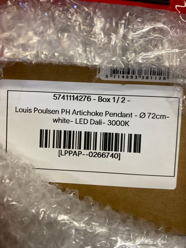
An installation story
A customer note says deliveries began on December 16, 2025, for a configuration specified as LED 3000K with DALI control and an integrated driver, finished in white. In their words, the key decision was aligning the light engine and controls with a broader lighting plan rather than treating the pendant as a stand-alone fixture.
Where it fits best
The PH Artichoke suits interiors that value quiet structure: warm minimalism, mid-century-informed rooms, and contemporary spaces that need a single organizing element overhead. It also works well in mixed-material schemes—wood, stone, plaster—because the light reads as even and non-theatrical. If you’re building a room around one pendant, it’s a strong candidate precisely because it doesn’t rely on glare or beam to make its point.
#LouisPoulsen #PHArtichoke #PoulHenningsen #DanishDesign #ScandinavianDesign #PendantLighting #IconicDesign #LightingDesign #MidCenturyModern #DiningRoomLighting #EntrywayLighting #ArchitecturalLighting #ModernInteriors #DesignClassic #GlareFreeLighting