

Louis Poulsen PH 5 Pendant Lamp: Poul Henningsen’s glare-free classic, revisited
A modernist pendant that still reads as current
The PH 5 is one of those fixtures that feels familiar without becoming invisible—recognizable, yet still crisp in contemporary rooms. Its silhouette is graphic, but the experience is fundamentally about how it manages light. For a closer look at the current offering, see the Product page.

Louis Poulsen and the “form follows light” mindset
Louis Poulsen’s best-known pendants often start from a single brief: make the light comfortable, then let the object follow. The PH family sits at the center of that approach, and the PH 5 remains a reference point within the brand’s broader decorative catalog. The brand’s own overview frames the PH 5 as an “icon” that continues to circulate between public interiors and private homes.

Why the PH 5 exists
Poul Henningsen designed the PH 5 in 1958, prompted by the era’s shifting incandescent bulb shapes and the glare issues those changes could introduce—an origin story Louis Poulsen documents directly. The lamp’s logic is tied to Henningsen’s wider “three-shade system,” developed in the mid-1920s to shape light with measured reflections rather than exposed brightness. Background references: PH 5, PH 5 Mini, and Louis Poulsen’s notes on the system’s 1925/26 development via the PH three-shade family.
Design details you notice in daily use
PH 5’s layered shades push the strongest light downward while maintaining a gentle lateral glow that helps the fixture read as warm rather than stark. The geometry also shields typical sightlines to the light source, so the pendant can hang over a dining table without turning into a bright spot in your peripheral vision. Its internal color accents began as a practical correction for older light sources, later simplified as modern bulbs improved—again noted in the brand’s product history. For broader context on Henningsen’s 1958 run of glare-controlled pendants, Architectural Digest offers a useful editorial snapshot: Architectural Digest.

An installation note from a recent order
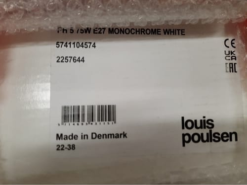
A customer entry notes the PH 5 was processed for shipment on October 23, 2025, selected in a monochrome white option. In practice, that reads as a clean, architectural presence—more about the lamp’s shadow control than color contrast.
Where it fits best
The PH 5 is most convincing in spaces where you want the table (or countertop) to be the brightest plane, without glare at eye level: dining rooms, open kitchens, and calm work-from-home corners. It also holds up in mixed interiors—mid-century wood, contemporary stone, or pared-back white walls—because the shape is doing the work, not ornament. Grouped or singular, it reads as a deliberate lighting decision rather than a decorative flourish.
#LouisPoulsen #PH5 #PoulHenningsen #DanishDesign #ScandinavianLighting #PendantLamp #LightingDesign #MidCenturyModern #ModernistDesign #DiningRoomLighting #InteriorArchitecture #DesignClassic #GlareFreeLighting #KitchenLighting #NordicInteriors